|
Poly Politics continues to be a relevant and frequently visited site, but as the site nears its 5th year, a refresh is much needed.
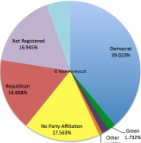
The resulting product of this refresh is a site that I think is brighter, more user-friendly, and presents the data in a much more streamlined manner. I hope you will agree. Data, as you will see (or already have seen) is presented in a slightly different format. In addition to the names of faculty in every department (at the time when the data was collected) and the pie-chart for the department/area, the specific numbers for each category are also enumerated. The use of Google Sheets to display the data will also facilitate easier updates to the data in years to come. Further, using Google Sheets makes it easy to quickly switch between years, to see how the partisan split of individual departments, of colleges, or of the campus overall may change over time. And on the note of updates to the data, with the most recent data coming from the 2013-2014 academic year, it is time for an update! So, also to coincide with the site entering its 5th year, updated data is forthcoming! Expect updated data to be posted by November (I'll post here when everything has been updated). I hope interested individuals will continue to find the data relevant and important. I also hope the data will lead people to pause and consider what it means, particularly as related to viewpoint/intellectual/viewpoint diversity. Enjoy the site!
0 Comments
Your comment will be posted after it is approved.
Leave a Reply. |
Blog serves as a forum to discuss findings, trends, and implications, as well as to post about updates to the site and/or data.
Author

Nathan Honeycutt
Archives
June 2018
Categories
All
|
 RSS Feed